Image source: Amazon
This week I am sharing with you my views on the book City of Nine Gates by Pankaj Rajput. First of all I thank BlogAdda for offering me to review this book. The format of this book is complex so that it cannot be classified into any particular category. It has a story containing brief and frequent episodes of time travel and fantasy. Indian philosophy is the backbone or rather the foundation of this work. In a way, you can say that Rajput has used the narrative to explain the basic concepts of Indian philosophy. Keeping this in mind, note that the narrative itself is of secondary importance here, whereas the philosophy remains the primary objective and highlight of this work. Also note that the success or failure of any published book depends not only on the writer but also on the publisher and editing staff.
The central idea of the narrative is as follows. Excavations at a site in the Himalayas reveal ruins of an ancient city. The protagonist of the story notices certain peculiar features in the photographs of the excavation site. From his knowledge and understanding of history, archaeology and architecture, he is able to conclude that the structure was not a temple as claimed by the locals, instead a fort. He is further able to identify similarity of some objects in the photograph with those in his personal collection (to be precise, a compass). Thus begins a journey into time, or rather a journey of self discovery. From the very beginning, Rajput introduces metaphors and concepts of ancient Indian philosophy (mainly Upanishads) one by one, which would eventually be used when he elaborates on the subject. This is the most important part, and if grasped, would bring immense benefit to the reader. I would not comment on Rajput’s interpretation of the ancient Indian philosophy, nor would I label it as right or wrong because that would imply that I myself understand that philosophy better than him, which would be boastful and arrogant. It is not without reason that people resist from talking about Vedanta. I would rather restrict myself to Rajput’s writing style, and the strengths and weaknesses of this book.
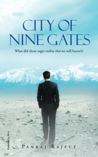
Let us take a critical look at the design and style of the work. To begin with, the back cover of the book is absolutely fantastic. On the front cover, the colour and font style are very pleasant and soothing. Surely the book is bound to catch your eye even in any crowded bookstore. However, the image seems to have been taken from any Jeffrey Archer novel. I was particularly disappointed by the front cover because given the scope and narrative of the book, the artist had plenty of opportunity and options to come up with a more appropriate and suitable cover which would have been unique in its own way.
The whole storyline is divided into different chapters which are of modest length. You can very easily cover each chapter in a single sitting. The printing and font are very elegant and clear, and font size is suitable for a relaxed reading experience. Every page carries header, with the one on the left page giving title of the book and the one on the right page giving the name of the author. While book title is fine, I could not understand the logic behind giving the author’s name in header. Instead, they could have given the title of the chapter. Within each chapter, there is continuous movement either in space or in time or both. Every such change in location is nearly always sudden and awkward. I would suggest to break the chapters into various sections, which could be either numbered or simply divided by blank space between paragraphs.
The language throughout the book is very clean, containing no obscene or abusive words. The writer has special talent in narrating fast paced sequences and action scenes. I look forward to more quality works and compositions from the writer making extensive use of this style.
The flaws of the book are mostly related to poor writing, poor editing and poor proof reading. Now, I am not sure who to blame for these blunders, whether it is the writer or the publisher. But whoever it is, the matter is serious. The writer must take extra blame because it is his debut novel, and he simply should not have taken any chances. Based on the general impression he creates through his first book, the readers would decide whether to read his other upcoming works or not.
Let me enumerate them one by one. First come the spelling mistakes which could have been simply removed by even a casual proof reading. See for example,
“Aham-bhramasi? I don’t know what you mean.” (page 4)
Is it ‘bhramasi’ or ‘brahmasmi’?
Now what sort of Sanskrit is this? If the writer is not familiar with verb conjugation in Sanskrit, it is OK. No offence. Just use its translation in English. Why to write incorrect sentences, hoping that the readers would not notice anything?
“…Change is an attribute of Nature and not it’s”. (sic) (page 32)
Then there is ‘harldy’ for ‘hardly’ (page 21), ‘relived’ for ‘relieved’ (page 34), ‘travlled’ for ‘travelled’ (page 35), and many many more.
Next comes the comma. They have been given no attention at all. The commas have been thrown around at random — sometimes not given where they should have been and sometimes given where they should not have been. Consider these instances —
And when he gave the next gentle blow, the pillar, split open, moving apart. (sic) (page 8)
“…Without me, people are lost here, within it, for many lifetimes…”(sic) (page 30)
There are also inappropriate words. Note that this is not about a personal preference of the writer. I would have gladly accepted it if the writer had done any experiments with choice of words. But here I am talking about an entirely wrong selection of words. When there are so many avoidable errors in the book, then you can easily guess how many grammatical errors must be there, especially those related to tenses.
One characteristic feature which I found the most annoying and irritating is the italics. It went to insane degree as soon as I started reading the book. Italics are used here to lay stress on certain words or phrases, or to indicate the words from other languages (mainly Sanskrit), to mention names of places and people though it was not necessary, and to indicate some hidden/deep meaning behind a sentence giving a supposedly subtle hint to suspense or mystery. But when whole pages are getting filled with words in italics, the author definitely needs to look again at his style. It is utterly ridiculous on one end and downright annoying at the other. What more, there is a word in italics in the title also. Look at the image and see the tag line. Do you think it was at all required?
Since the subject and theme of the book is delicate and risky, the writer should have done thorough ground work. However, it is nowhere reflected in this 296 pages long text. The book is superficially written and carelessly edited. If we weigh the various factors considered so far, nothing justifies the high price of the book.
I think I should stop here. As this is Rajput’s first novel, I do not want to be too harsh. Also, in the rat race among contemporary Indian writers to explore the scriptures, mythology and Puranas for inspiration and ideas, Rajput is perhaps the first writer to have experimented with Vedanta. That he had limited success does not take the shine away from the fact that he has at least tried.
Author: Pankaj Rajput
Publisher: Notion Press
Print Book Length: 296 pages
Price (Paperback): Rs. 285
My rating:

What it means?

